
UX Case Study - Designing Pocket Chef - your personal recipe app
by Shawn Weigand
The Problem
With parents staying at home and cooking for their families, my partner and I were tasked with designing a mobile application in which these parents are able to discover new recipes to cook for their families.
While designing a whole new app to serve such a wide variety of people sounds like an overwhelming task, conducting user research served as an effective way to narrow down on what is truly important to the people who would be using the product.
In order to obtain useful information about how the app should be designed, both surveys and non-direct interviews were conducted.
Five non-direct interviews were completed in which a casual conversation was had with the target demographic. Since it was difficult to find stay-at-home parents, we decided to ask five parents in general. The results were extremely beneficial in understanding both the cooking habits and tendency to try new recipes of the users. A few very important key points were derived from these interviews that would play a crucial role in helping to shape the app:

- Simplicity, ease, and time were of utmost importance to the target demographic
- Avoiding certain foods due to allergies, dietary restrictions (ex: vegan), and picky eating played a huge role in what recipes the parents decided to cook
- Convenience in using ingredients already at home or food the the family is craving was a driving force behind what recipes were ultimately chosen
- Information about the general taste of the food, difficulty, and time are most useful in the form of a rating, which is an initial attractor to a recipe.
Over twenty survey responses were recorded in order to gain some helpful guidelines to follow in pleasing the users. Surveys are extremely useful in gathering quantitative feedback from a large group of people that would be difficult to talk to individually. The qualitative feedback received confirmed the points taken from the interviews. The most useful quantitative feedback can be summed up in the following charts.
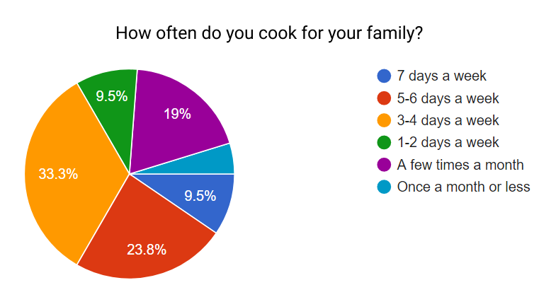

From the pie chart, it is seen that most parents have to cook for their families every week, with the most common response being 3–4 times a week. While the table shows that a majority of parents try new recipes regularly, whether that be weekly and monthly, there are still a lot who do not.
The goal of this application is to fulfill the needs of the users in creating something that caters to their individual ideas of a finding the perfect recipe to make.
Persona
In order to understand where the parents are coming from, a persona was created that reflects their desires.

Cooking Collin represents a middle-aged, stay-at-home father who is in charge of cooking for the family each night. While he wants to eat healthy, he must also make sure the recipes are fit for the rest of the family — the kids are picky eaters and his wife can’t have gluten! On top of this he prefers if the meal can be made in a timely matter and would be even better if he didn’t have to make a grocery run for one meal… Sounds like a lot to consider!
Branding
By taking Collin’s persona into perspective, we noticed how a lot of cooking sites target females as their audience. We wanted to appeal to all parents with our app and Collin helped us to keep this in mind.
The first step to out branding consisted of choosing colors. The first colors thought of was the yellow. We felt that it resembled wheat and conducted a warm and inviting tone while conveying the message of cooking. The blue was added as a contrasting color and was made to match the gentle tone of the yellow.
The Quicksand font stood out as the perfect choice for our application because of its ease in readability and clean, yet cheerful shape. We wanted it to be inclusive, non-threatening, and easy to ready as both a header and body text for the recipes.

Now its time for the logo. With a name like Pocket Chef, we found a fitting logo to consist of a chef in a pocket (genius, right!). While it does fit the description of our app title, the logo also includes our app’s primary two colors with the app title underneath in our font of choice. The plate in the back rounds out the logo and provides as a backdrop to clearly see the image. Two versions of the logo exist for both dark and light backgrounds, which were both useful when building out the app.
Overall, we feel that the logo matches the style we are developing, works for all audiences, and promotes the idea of the app: a helpful recipe guide available at the tips of your fingers.

Landing Page
The next step was designing and coding a desktop landing page for Pocket Chef using HTML and CSS. Sticking to our font and color scheme, we developed a simple page using an HTML template where you can download and read some quick info on the purpose of the app.

Wireframing
Wireframing is where the first visuals of how the app will appear are created. The main aspect we focused on was parameters in order to fulfill the needs of the users. The on-boarding process asks a few questions about preferences while the beginning screen separate everything into convenient categories. The viewing of the recipes reveals useful information like time, difficulty, rating, and ingredients — all of which were listed by the users themselves as the primary aspects in choosing a recipe.

Mockup
Mockups are where our wireframes come to life. We were able to expand the wireframes to how they would look on the application itself. We chose a simple design with images of food in the back to convey a gentle tone. The on-boarding process consists of signing up, choosing food restrictions/dislikes, and the number of people you typically cook for.

The actual functionality of the app starts with the home page after signing up or logging in. The bottom buttons are a home button, trending button, and favorites button. A search bar exists on the top of most screens so the user can search for a recipe based on any parameter they want.
The home screen has four buttons for types of meal (breakfast, lunch, dinner, desserts), with each meal page having four subcategories to look in (trending, quick meals, challenge, ingredients). When one of those options are selected, a page of recipe cards appear that contain a picture of the meal along with the the name, favorite star, rating, time, difficulty and ingredients. Clicking on the card expands it to reveal the description of the meal and a button linking to its full page.
On the recipe itself, all of the card information is present and also includes the steps to make it and a video of how to make it. Extra information icons are present on the video and ingredients, which reveals the item description and ingredient amounts when pressed.
Lastly, the menu icon on the top left allows the user to access the shopping list. Items can be added to the shopping list on the recipe screen where the ingredient amounts are shown. On the list itself, the user can check boxes to mark ingredients they have purchased to make a recipe.

Prototype and Usability Testing
Putting together all the version one mockup designs, a prototype can be made to connect the screens in order to conduct usability testing.
Running usability tests plays a crucial role in seeing how your product design holds up against real users. In our case, we were able to learn a few things about the layout of our design that help to improve the understanding of the app.
The first bit of feedback was to include indication that an option was selected during the on-boarding process. We added a blue overlay to the button once selected to meet this suggestion.
Next we switched a gear icon to the hamburger menu icon and moved the location from the top on the right to the top on the left. The user said that they did not expect a gear to bring up a menu and thought that it makes more sense to situate it on the same side of the screen that the menu appears from.
Lastly, users tried to click the logo icon on the top bar to go back home, so we added a way for that to act as a home button.

Conclusion
Cooking is something that everyone has to do, and finding new food to make should not be a tiresome task. Fortunately, following the UX process of identifying the problem, conducting research, creating a persona, branding, wireframing, creating mockups, prototyping, and conducting usability tests allows an aesthetic and functional cooking app to be designed to address the issue.
